The Nature Conservancy
Newsletter Design; Student Project (UMGC 2025)
Concept:
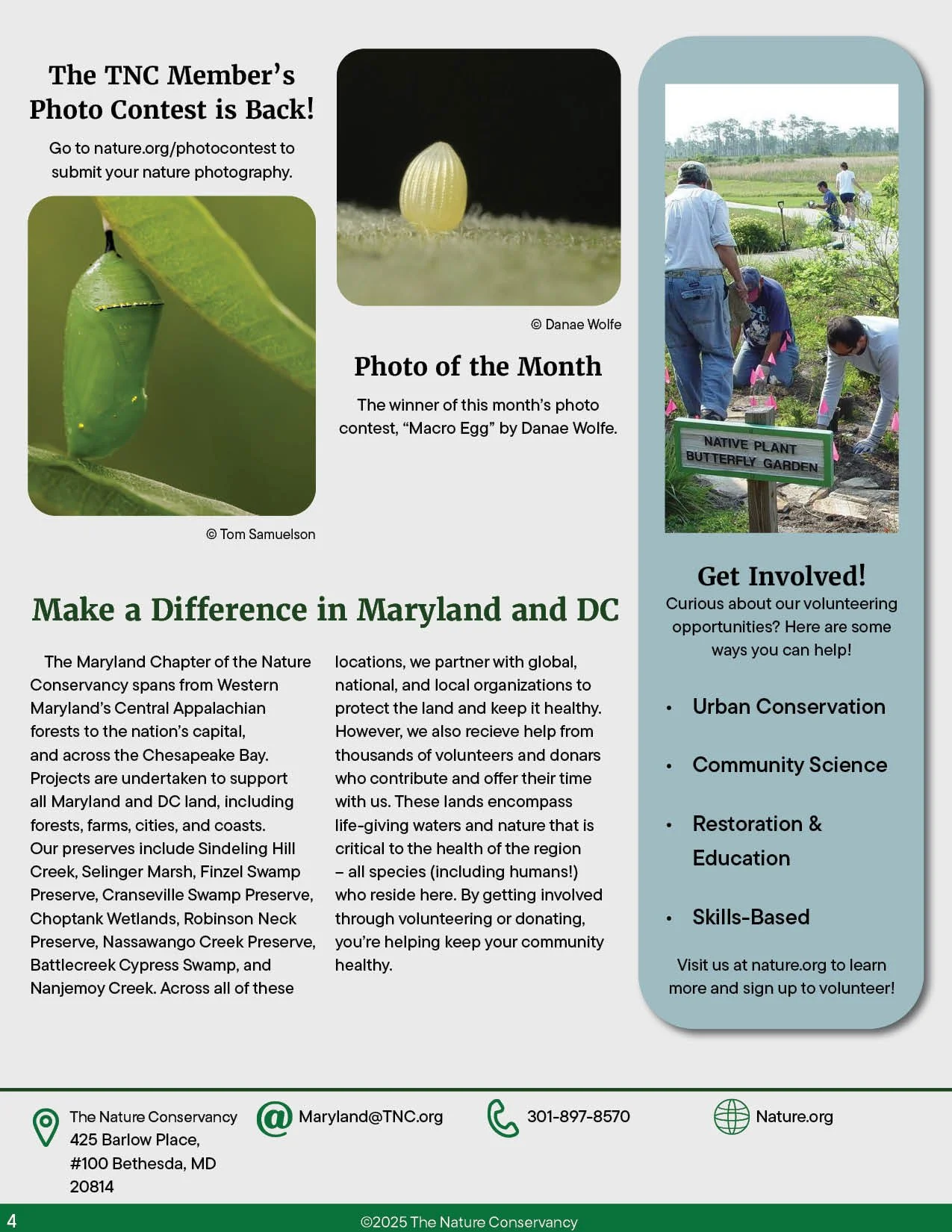
Creating a standard typeface, color palette, header and footer to be used consistently across TNC monthly newsletter releases will help create a recognizable identity for them. A dynamic layout breaks up text with photos, pull quotes, and calls-to-action. Hierarchy focuses on directing the readers’ attention to important information and keeping them engaged. The typography is chosen to prioritize legibility and credibility, keeping the appearance professional but still friendly and inviting. The color palette harmonizes visually and thematically with nature, and is kept to muted, soft earth tones to allow any featured photos to stand out.